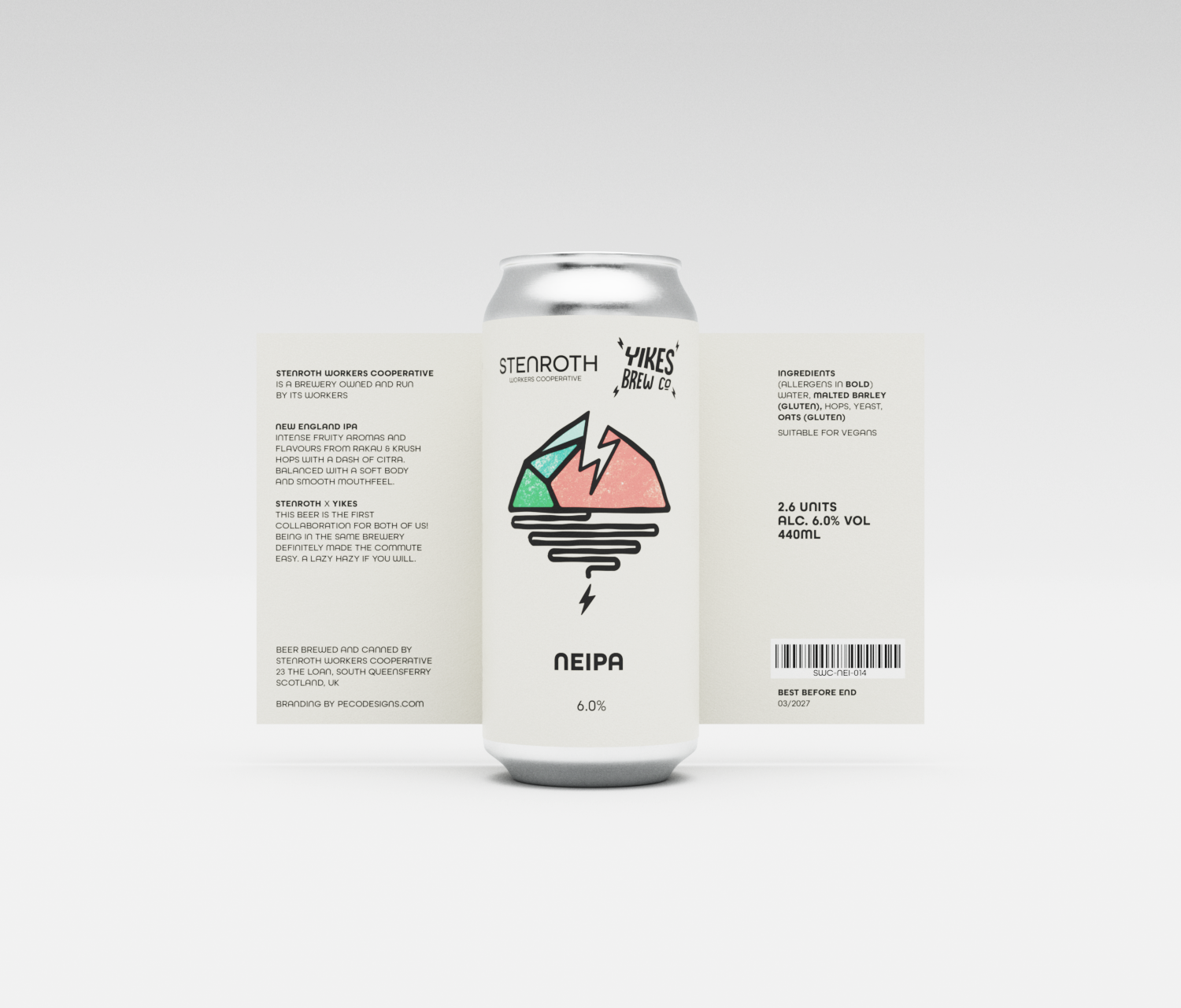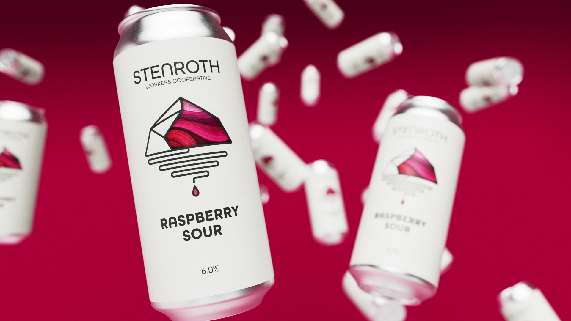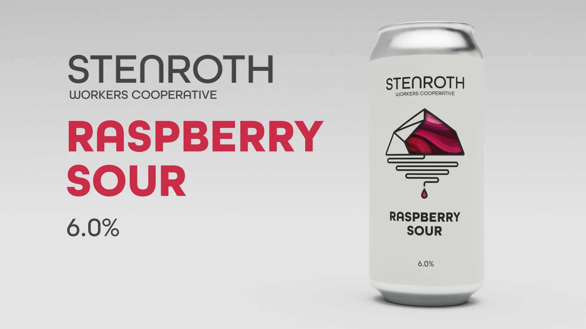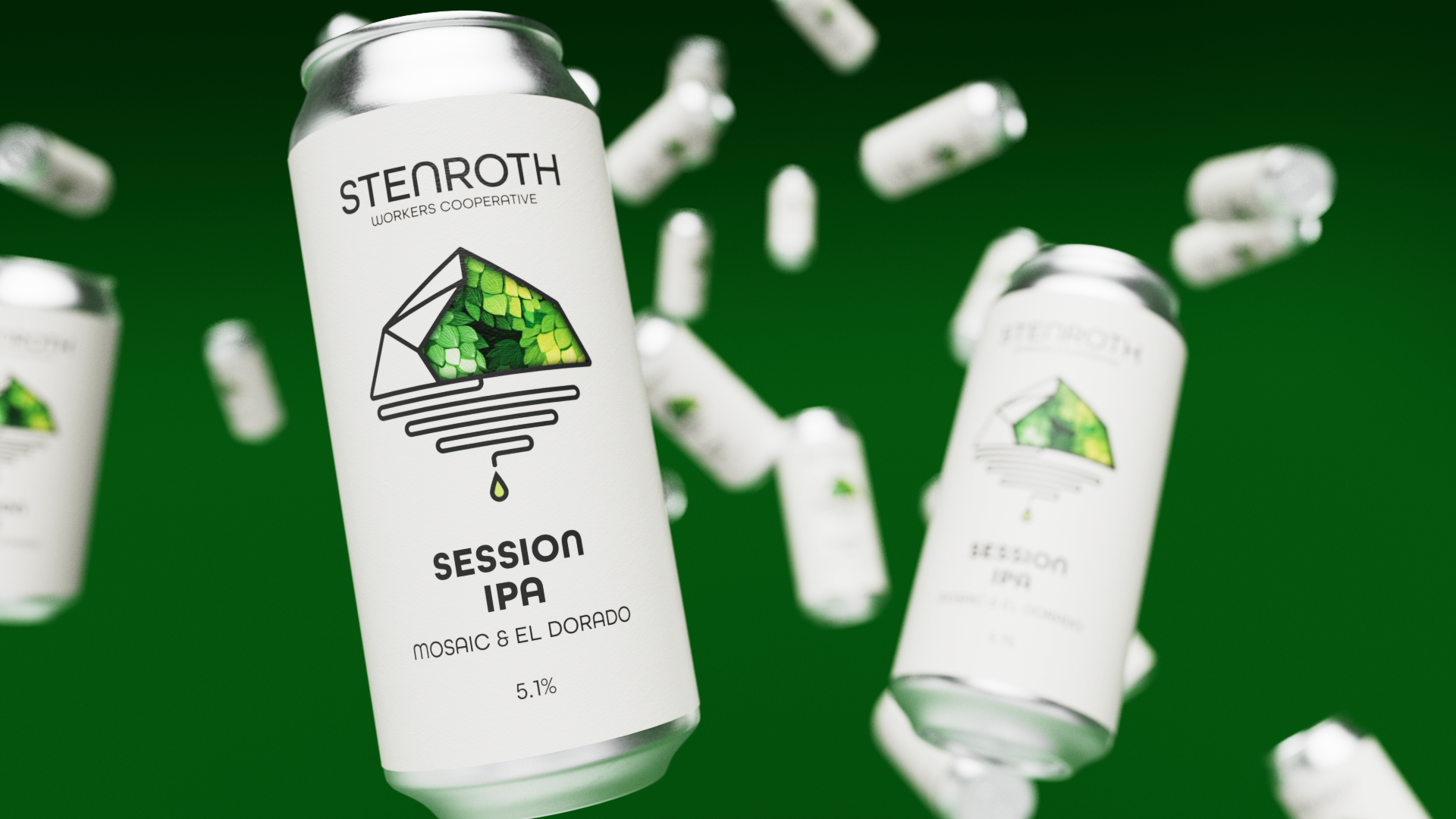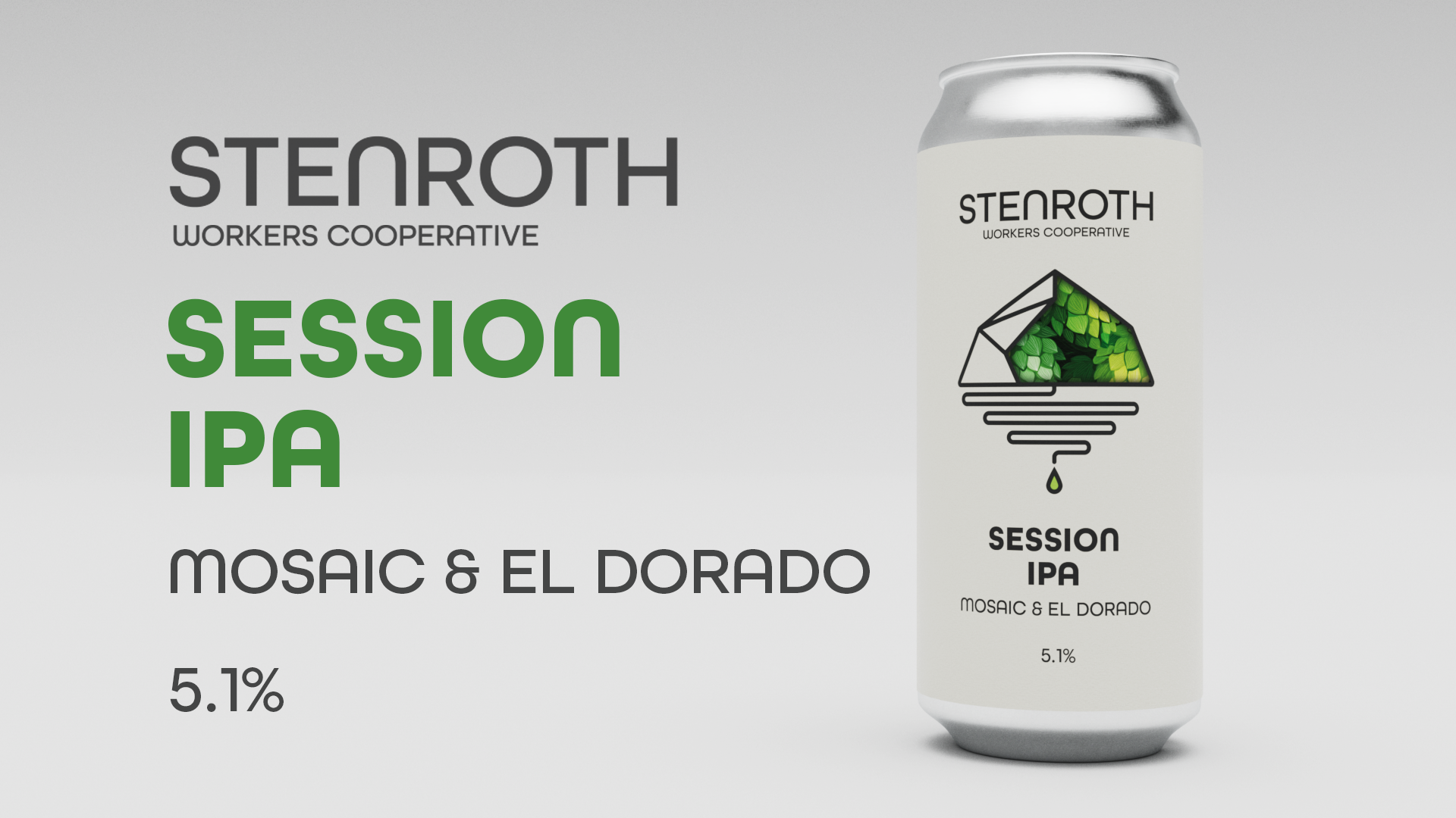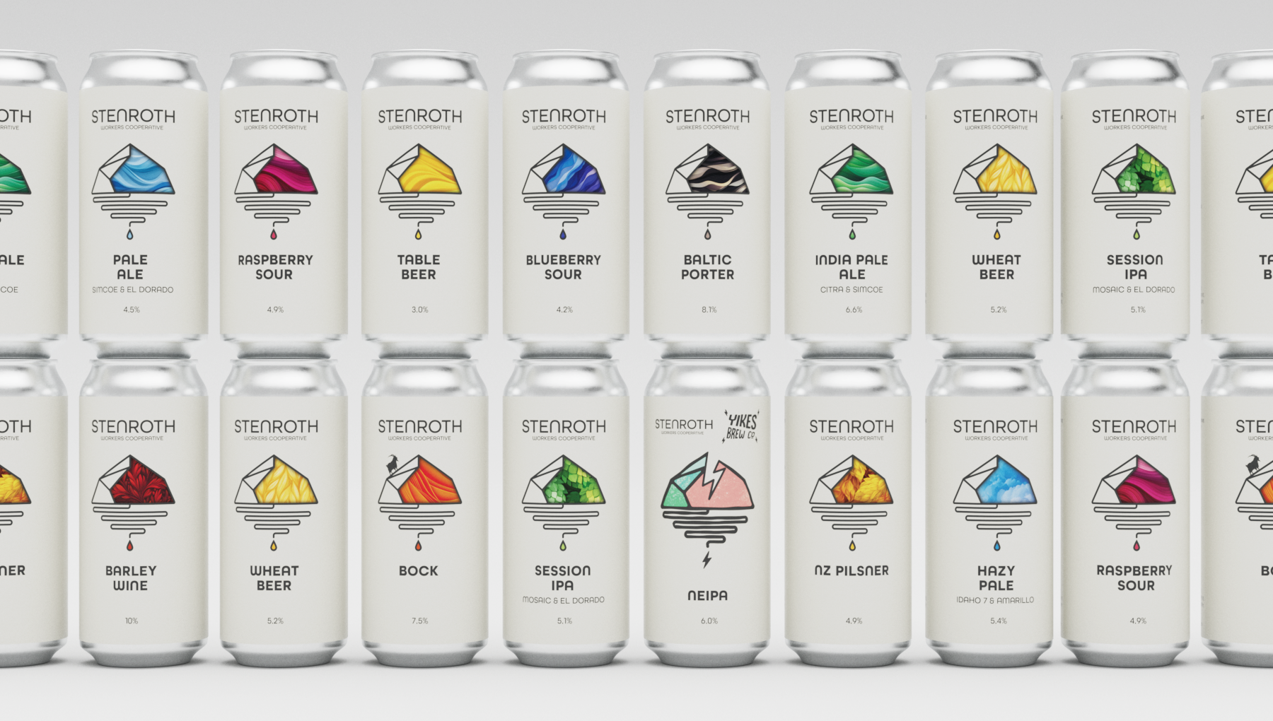
After designing the Stenroth logo, I was commissioned to create their first range of beer cans. As a craft beer enthusiast, I understand how crowded and visually loud the category can be. Rather than compete with that noise, we took a different approach.
We developed a clean, minimal visual system using the Stenroth mark as a consistent framework, allowing each beer to express its own character through subtle color and texture. This approach creates strong shelf presence through restraint—delivering clarity, cohesion, and instant brand recognition without relying on excess.